Showing posts with label 6" x 6" oil on board. Show all posts

Sunday, January 30, 2022

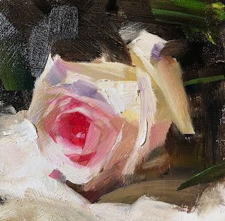
Rose study 012922


I have adequate amount of understanding (I think) about non-cadmium red color family, and also I get a little tired of painting individual red roses. I mean the result was not bad, but I felt I became a sort of handicapped in painting after I started to develop my non-toxic palette. Many skills I used to have are no longer working any more. It just like our physical body. We take it for granted until we get into a injury. I must be patient during this healing time. I use to be so picky about the difference between oil primed and acrylic primed painting surfaces. Now I just laugh, and let it go.

Thursday, January 27, 2022

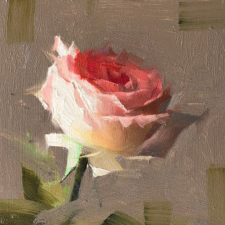
Rose Study 012722


The red rose opens up more, so I did another study. I have put transparent orange into radiant red created a much warmer and lighter red. I also use dark background this time. I used the water mixable burnt sienna and ultramarine blue made the dark. The issue with WMO is the viscosity. They are too sticky. 

Tuesday, January 25, 2022

Rose study 012522


I don't paint many red roses, because they are so hard to do. Since I am working on my non-toxic red palette, I painted the today's study. I will say that the cadmium red light is a color that is very hard to replace. I use napthol scarlet as the replacement, but have a hard time to get the opacity and vibrancy. I used alizarin for the darks of flower. When I need opacity I put a little venetian red. For the high light I use radiant red. It might be slightly too cool. Anyway. the experiment went well, but not great.

Sunday, January 23, 2022

Rose Study 012222 Sold


After having a set of non-toxic colors for the yellow family, I moved on to investigate the red. I did this study using radiant red, napthol scarlet, quinacridone red, alizarin, venetian red, and portland grey deep. I feel I am in the right direction. Napthol scarlet still has some toxicity. I will keep on the research until I have a satisfied result.

Tuesday, January 18, 2022

Rose study 011822


 I feel satisfied with the rose study I did today. The paint opacity finally worked effectively. I did not use the water mixable oil today. I used regular oil but no cadmium and no solvent. The dark opaque color in the shadow was Portland Gray Deep and Transparent Orange to start with, then I add Permanent Orange and Hansa Yellow. The light yellow was Radiant Lemon. I feel Gamblin's Radiant colors have good opacity, and so does the Portland Gray. Now I have a set of non-cadmium colors to use for the yellow family. 

Wednesday, January 12, 2022

Rose Study 011222


I used the same palette I used two days ago, but introduced in Portland Gray Deep, and Transparent Orange. The opacity is still not ideal. Look at the petal on the right in shadow. It is rather difficult to make the color uniform. Can anybody tell me if it is OK to mix a water soluble color into regular oil colors? Thanks.

Monday, January 10, 2022

Rose study 011022


I have done another rose study today, I used ultramarine + burnt sienna (water mixable) for the dark under painting, then used paper towel and water wiping out the rose area. The colors for the rose were Hansa yellow, Indian yellow, Permanent orange, Quinacridone red, and White. They were regular oil colors, but there were no cadmium colors at all. I used Gamblin solvent free gel as the medium. No Gamsol this time. The result was not bad. The major issue was that the opacity was weak. The light area was easy. I can use white, but the mid value area is still weak. I may try some sort of ochre next time.

Friday, January 7, 2022

Rose study 010622 Sold


I have started painting again. I did this small study yesterday. I am experimenting the water mixable oil. I used ultramarine and burn sienna (both from Holbein) to mix my dark, and use my wiping technique with water to create the light shapes. Then I use regular oils for the color part. It feels the water mixable oil and regular oil go together OK, but I have no experiences and will know better in the future. If you are using water mixable oils, I will appreciate if you give me your advices. I am glad I did not use any mineral spirit for this study.

Tuesday, May 12, 2020

"Red and Green"


Click Here to Bid

This is dangerous. Red and green are almost complimentary. It is rather difficult to harmonize these two colors together, but I did it anyway. Do I like this color scheme? I don't know. It is kind of interesting.

Friday, May 8, 2020

"Green Yellow Scheme 050820"


Click Here to Bid

Continuing on my color scheme research. Yellow and green can be analogous, but we need to be careful. When I paint this one, I significantly tone down the chroma of the green to almost gray. If both yellow and green have high chroma, the scheme may not work. If the green is darker, it will be even worse. On the color wheel, yellow sits between orange and green, and we all know yellow and orange get along well. They can form a very harmonious analogous scheme, by why green and yellow can not getting along?

Wednesday, May 6, 2020

"Complementary color scheme test 050620"


Click Here to Bid

This is another test of my color research. Today's scheme is complementary colors: red and turquoise. As a matter of fact, "color scheme design" is a big topic. It does not have to have any realistic base. How should we group a set of colors together and make a good presentation? I don't have adequate amount of information to answer this question. That is one of my purposes of doing this research. The colors of my paintings (this one and previous one) are NOT from my still life setup. I got on the internet and searched for "color palettes for website designs", and decide which online palette I want to use. Then I choose objects and background drapery to match as much as possible to computer color palette. I also plot the colors on the color wheel so I know which category of schemes the set of palette belong to. So I had a complementary one today and an analogous one last time.

Monday, May 4, 2020

"Harmony with warm colors"


Click Here to Bid

This simple painting has shown the fruition of my color research. After getting deeply into color theory and measurement using math, and strategies of color mixing, now I move onto aesthetics, color psycologry and color scheme design. This one uses an analogous color scheme centered at warm yellow. It has developed from my earlier monochromatic scheme with yellow. The palette I used for this painting was burnt umber, yellow ochre, cad yellow lemon, cad yellow deep, cad orange, cad red light, quinacridone magenta, radiant red, and white. I did tested this color scheme on the computer first. Science does work.

Saturday, May 2, 2020

"Still life under cool light"


Click Here to Bid

This is another daily painting exercise. I used all cool colors to obtain an analogous color scheme to maintain harmony. The paintwork is rather rough to give a painterly look. I will tweak this color scheme more to make it work even better. If you have any suggestions, Please let me know. I appreciate it.

Friday, April 24, 2020

"Still life in Yellow study 042420"


Click Here to Bid

My today's post is a monochromatic painting using my yellow scale. The colors I used were black, burnt umber, yellow ochre, cadmium yellow lemon, and white. This kind of painting probably has no market value. I did this purely for my academic curiosity. Maybe I should pay more attention to the action items on how survive in this difficult time, but some how my mind has been trapped deeply into this research. I am following my heart, and let the future manages its course.

Friday, April 17, 2020

"Red Rose 041220" --- Sold


I did this small painting a few days ago as a small commission. A friend sent an image of one of my small paintings I did a few years ago and asked if he could buy the painting. The painting was sold long ago. So I said I can do a similar painting. So I did this one. When I was painting this one, I felt I have gone back to my old "Daily Painting" days. It was so nostalgic. It was the good old days. Well, if you have similar request, please let me know. I will work with you. 

Sunday, October 7, 2018

"Shanli Bridge" --- Sold


I did this painting when I was in China. It feels my China trip has been a long long time ago, but in reality I came back only 10 days. It is so odd.

Sunday, January 14, 2018

"Winter Colors" --- Sold


Click Here to Bid

January 15, 2007 was the date I posted my very first painting on my blog. Since then, I became a "daily painter" and marketed my art on the Internet. Now, 10 years have passed. I am happy I have made it so far. I am grateful for so much support I have received. I am extremely humbled for the art journey is harder than I thought ten years ago. Do I regret? I would say "maybe", I could have been a lousy engineer and provided much better "security" to myself and my family, but I will say "No". I have lived honestly with much more happiness.

To celebrate my 10 yrs anniversary, I did this 6"x6" this morning. I will put in on the daily paintworks auction with a starting price of $100.  This was I did ten years ago almost everyday.

Saturday, August 13, 2011

“Plein Air Indoor"

Click Here to Bid

I am continuing my practice in my high key world. I felt I painted a plein air landscape today. I had so much colors on the painting. Since I haven't done enough this kind of painting, my brush work is not free enough, and the painting took much longer than I thought it should. Anyway I felt good. There is so much I can work on.

Wednesday, August 10, 2011

"Make Me Clean"

Click Here to Bid

My today's painting is one of the high key paintings that I feel satisfied. You may have noticed that my paintings are getting a little tighter lately. That reflects my recent mental uptight-ness. Now I must rely on my art to bring food on the table, so I am not as idealistic as I was before. This concern has its positive effect. It makes me paint more. However, I don't want to see my art life is completely controlled by the market. This a couple of days I lost more and more confidence on the almighty Money. Maybe that is the beginning of the real freedom. We feel bad when our dreams turn into nightmares. However on the other hand, our nightmares will wake us up, so we will realize that we have been attached so ridiculously to something so unreliable. I think this realization will be the so called "Enlightenment". I hope someday I may reach that. But, I am not there at this moment, so you have to pay if you want to buy my paintings. But I can promise you that the value of my art will not go down with the paper money.

Friday, July 22, 2011

"One and Many" --- Sold

Click Here to Bid

Strawberries are on sale in our local grocery. We got a whole bunch. I think I painted strawberries before, but I don't remember when. So I did a small one last night. I really enjoyed. I don't know why I haven't paint strawberries more often. I think I will in the future.