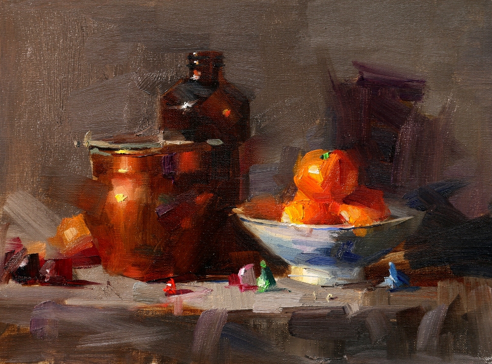
This is the second demo I did for the workshop. I feel I have mission to accomplish. You see the background color of this painting. It is a so called "dirty" or "muddy" color. Currently I don't have very clear understanding how to distinguish "muddy" and "muted" colors. I know there must be some identifiable factor to tell the difference. I believe a color looks muddy in one condition and looks muted (but clean) under another condition. They are actually the same color. The key is to figure out in WHAT condition this will happen. The background color for this painting works well. Can you tell me why?


6 comments:
It is my experience that mud happens when the combined pigments (of the accused mud) do not appear elsewhere in the painting as purer variations of themselves. For me, I solve this problem mostly by working with a limited number of paint tubes (around 20) for each painting. But even still, sometimes I get mud or discordant neutrals if I am not conscious of how much of each pigment I've used. And I cannot overwork an area - making each mark honest and with distinct purpose helps control what I lay down and keep it from contributing to mud. However, that said, I am far from correct all of the time and struggle too with harmony. Thanks for your constant inspiration and example Qiang.
Daniel Edmondson teaches that mud happens when the colour mix is the wrong colour temperature. I think your background works well because it comprises the same colours used in the painting, as Kimberley said, and because it is a warm temperature like the warmth of the painting itself. Thank you for your thought provoking blog, I really value it.
Very interesting question! When I encounter this, I remember the words of Richard Schmid in his book "Alla Prima"
"When colours look "wrong" it is invariably because they are not the correct temperature for the harmony you are working in."Muddy" color, for example, is simply a color that is inappropriate in temperature-as when you place a cool color in what should be a warm shadow in your painting." (Page 144). These words always help when I have a color that looks like "dirt". For me, it is usually because it is too warm.
Love your work!
This is a great question - as I work primarily in pastel it is easy to make mud. Personally I think mud can be quite useful in the right circumstances. To me your background colour works because of the beautiful clean crisp colours of your focal points. True it is the correct temperature etc, but it is also unassuming and flatters the still life objects which are perfectly crafted by your use of colour and form to give each piece a different level of importance. I love your work :)
Making mud can indeed be a problem. I think this background works because the temperature is apparent and the elements of the color combination are recognizable.
Thanks for another question to learn from.
This is beautiful. The grayed down background makes your set up just glow.
Post a Comment