Olmsted Plein Air Invitational ended today. I did well. I got one award, and sold a few paintings. I am tired and happy.
Olmsted Plein Air Invitational ended today. I did well. I got one award, and sold a few paintings. I am tired and happy.

This is another blue bonnet painting. I consider it is mediocre. I must admit that I have not generated much of good paintings lately. I know exactly why this has been happening: because I am re-learning many things in art. These a couple of months, I am learning the science-based color theory like drinking from the firehose. You might have viewed some of my short video demonstrating interesting color phenomenon. That was just the tip of an iceberg. I was so involved of searching information online, and doing my own color studies. I wish I can show the progress on my paintings right now, but it takes time to find the right directions, and gain the right knowledge, then practice and develop new skills and experiences. Eventually, I should be able to show good effects on my paintings. I am progressing in baby steps. Please be patient with me. I will catch up. Please believe: old dogs are still able to learn new tricks.

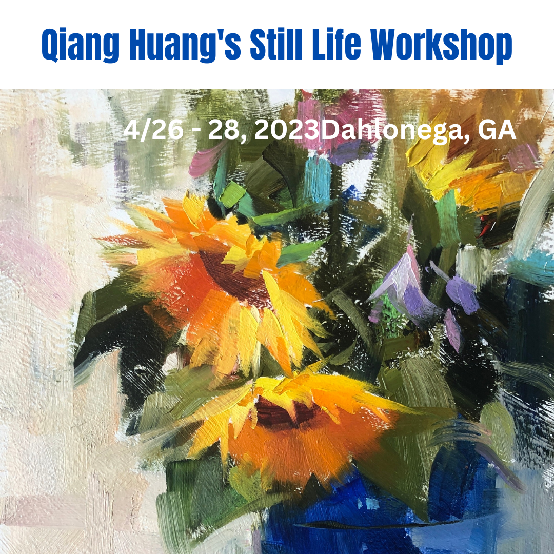
I did a few plein air blue bonnet paintings. I tested my recent understanding of CYM limited palette, and it worked. I used quin red, hansa yellow, and phthalo blue, and white. It was a little hard to mix grey with this palette, but for high chroma blue and green, it works well. My theoretical understanding does give me correct guidance. So now I painted more scientifically, instead of using experience (or intuitively).
So far I have found at least 4 types of color mixing mechanisms:
1. Additive, which applies to mixing colored lights. Blue and yellow gets white.
2. Subtractive, which applies to mixing transparent pigments or filters. Blue and yellow gets black.
3. Average additive, which is shown in this video. Blue and yellow gets grey.
4. Paint mixing, which applies to mixing opaque pigments. Blue and yellow gets green.
Isn't the color world amazing?!

A few days ago I was interviewed by Peter Donahue, a very knowledgeable color expert and teacher. Peter teaches a science based color theory, and he uses Tiktok, YouTube, and Instagram to teach. We artists have been taught the wrong color theory from the very beginning. Nowadays, there are still quite a mount of books and media are spreading the wrong color teaching. I have learned the hard way. Peter has wealth amount of information about color on his channels. Please check: https://www.tiktok.com/@color.nerd?lang=en


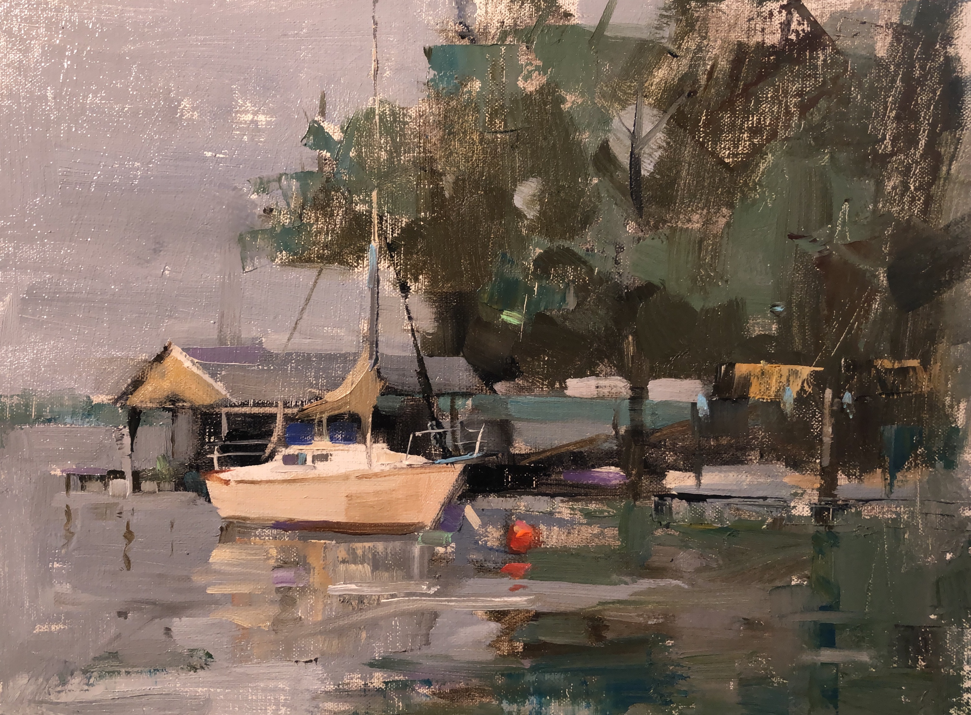
This painting was a plein air piece I did last year at the quick-paint competition of the Olmsted Plein Air Festival. I modified it recently based on a photo I took. Whether or not it had been improved artistically, I am not sure, but I am sure the green colors are more accurate. It was spring time like now. All the greens were fresh and intense. I used what I have learned about color lately and mixed the green colors really close to those on the ref photo. Greens are so rich in content, but we are short of words to describe them, I feel so grateful that we have numerical way to present them and we can pin-point their locations on the color wheel. The two images here demonstrates the difference between a scientific approach and a way of pure intuition.
.png)
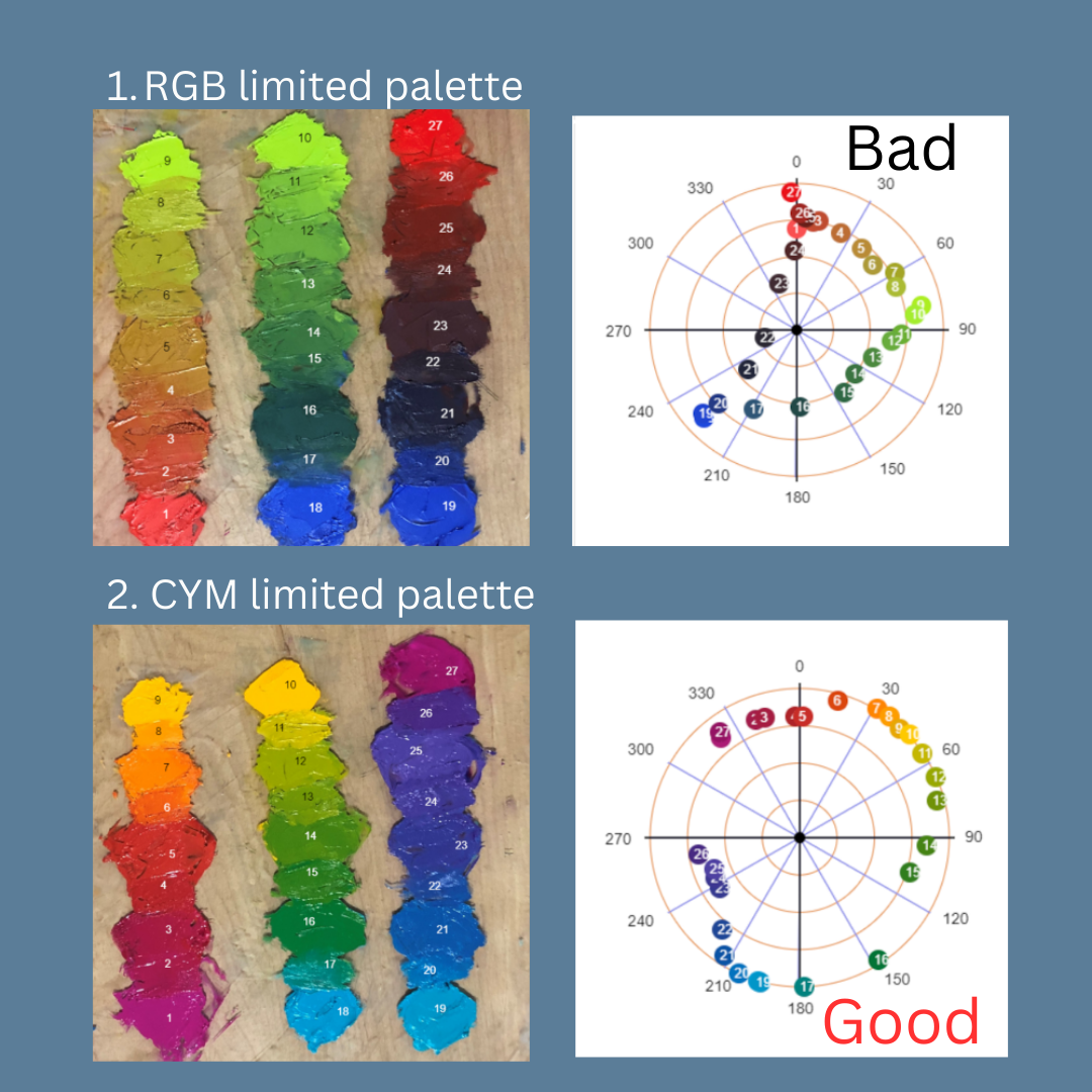
Two days ago, I posted my experimental result of RGB vs CYM limited palettes. Today I expanded my experiment including Zorn and RYB palettes. First of all, I want apologize that I should not label my result with simple minded "good" or "bad". All palettes have their own suitable applications. The purpose of this experiment is to demonstrate which 3-color limited palette has the highest mixing capacity, i.e. it can produce the widest range of colors. Please note color harmony and whether it can generate the best painting are not my current intention. I may address those issues in our future discussions. On today's presentation, the colored area are all the colors mixable with the given 3-color palette. Specifically, the Zorn palette was consist of cad red light, yellow ochre, and ivory black; RYB palette: cad red, cad yellow deep, and ultramarine blue. RGB and CYM palette have been described previously. The result is pure experimental. I conducted real paint mixing, and performed the measurements with my home made computer app "Color Analyzer" (located on my website, it is free for anyone to use). I hope this understanding helps you paint better.
My color research continues. Now I am working on mixing greens with blues and yellows. From our experiences, we all know blue mixed with yellow producing green, but on the computer color wheel, blue and yellow are complementary. It has been shown that mixing blue and yellow lights produces white light (additive), and overlapping blue and yellow transparencies, or mix blue and yellow ink, produces black (subtractive). So I mixed blue and yellow oil paints (manganese blue hue and cadmium yellow deep) as an experiment, and tracked the mixing path on the color wheel. I have seen that the mixing path does not go straight, but follows a curved path going through the green zone. This is why blue and yellow mix green. The curved mixing path is so important, but most artists do not know this including myself until this experiment. I have searched online to see if there is any theoretical explanations. I have found something called "Kubelka - Munk" equation. The K - M equation also explains the tinting induced color shift as I experienced earlier as well. If anyone have played with the K - M equation, please let me know. I want to learn more.


I did this painting as a commission piece for a collector. I have used two ref photos for this project. The first photo gave me the perspective, but it did not give me good light and value. The second photo has good color but with totally different perspective. I really like the colors of the pavement in front of the church. My recent color study helped me tremendously.
My color mixing experiments continued. A couple of days ago, I posted my observation of mixing ultramarine blue with white (tinting). I have noticed that the blue color has not only got lighter, but also has a hue shifting toward turquoise. Now I want to show this "tinting induced hue shift" occurs commonly to many tube colors. This short video shows what happen when I tinted 5 more colors. I noticed that 4 colors out of 5 have had the hue shift. Among these 4 colors, the most significant hue shift happens to transparent orange. We can see it changes from red to orange then even yellow during tinting. Of course, the color of the illumination source and the camera white balance may contribute to the hue shift, but this contribution is small. I also noticed the hue shift does not occur to all the colors. Yellow ochre in the video did not have the hue shift during tinting. I might have opened a can of worm, but we may be on something. I really appreciate the active discussion after my previous video post, and you all more than welcome to do your own analysis.


I will teach a 4-day workshop at the Scottsdale Artists' School on March 20 - 23. This workshop will reveal how to generate dynamic landscape paintings using reference photos. The best way to learn how to paint landscapes is through plein air painting practice. However, in many cases, using reference photos can be the only alternative. I will demonstrate a painterly style in the studio. I will introduce ideas on how to select photo references suitable for painting and using computer tools to enhance the photos. I will go through fundamental skills of drawing by covering perspective, proportional measuring, and compositional principles. I have a few computer apps to guide students on mixing colors to make the painting process easier. In simple English, I will describe color theory and how to use computers for painting. If you are interested in learning my painting approaches, pleases visit: Scottsdale Artists' School to register.
Instead, I'd like to show you a new video I made. It is my first birding experience. We are all connected, but I only know this theoretically for a long time. I paid more attention to my personal development, spending most of my time to accomplish my personal goals. I was motivated to work hard and become a successful artist mainly for myself. Bird watching is different. I am purely an observer, the beauty is created by the nature, which I am a part of it as well. So I see the connection between the birds and me. We are all parts of the one.
I am currently experiencing burnout with regards to painting. Since returning from Florida, I have not picked up a brush and instead focused on other pursuits. I have been experimenting with video editing and creating beginner level videos, although my goal is not to become a successful YouTuber. In addition to videos, I have been spending a lot of time at my off-the-grid property, enjoying the connection to nature and the divine. I have also been working on home improvement projects, preparing for tax season, and organizing my garage and studio. While these activities keep me busy, painting has taken a backseat for the time being. I am aware that if I let my artistic side cool down for too long, it may be difficult to regain the momentum for it. However, my resolution for the new year is to live authentically, so for now I am content to simply observe and enjoy the world around me. (Please be noted that the above paragraph was rewritten by the AI of ChatGPT from my original draft.)



Waterlily is the most interesting thing I have ever painted.
It offers vast amount of flexibility to represent this subject matter and gives
the artist the utmost freedom for creativity. Waterlilies have relaxed the accuracy
requirement on size, perspective, proportion, local color, and shapes, so I can
fully concentrate on the geometrical composition, texture variation, and color
design without worrying my painting going too abstract to leave the
representational paradigm. The reflections in the water provide mainly the
vertical rhythmic structures while the lily pads generate most the horizonal resonance.
These two-dimensional periodic patterns interweave together and created endless
opportunities for artists to compose astonishing spatial music. I got hooked
immediately after I did my first waterlily painting, and it explains why Claude
Monet did not touch any other subject matters after he started painting
waterlilies.
Happy New Year to all of you. This video contains almost all
the paintings I have done in the year of 2022. As matter of fact, I do not consider
I personally did all those paintings. They are all manifestations of the
Devine. Usually, people talk about the new year’s resolution at this time. We want
to use what we’ve learned and hope to correct the path of life toward a better direction.
2022 is a special year for the world, and it is the first year after I survived
the cancer. I have learned tremendously. If I consider to have a new year
resolution, I will say I will try my best to live. Business, career, and personal
achievements are all start to fade away. The only thing left is sincerely living.
Be a sincere witness with gratitude to experience the beauty of the real Art of
the universe.

I hope all of you have had a great Christmas. I want to share a painting with you today, which is a 24" x 30" figurative and narrative painting . I also made a short video to document the painting process. For this relatively large painting, I do not have enough experiences, especially figurative work. To get the proportion correctly is the major challenge. I want to say that the apps I have on my website have really helped me to see better. This painting took me more than ten days to do. I have learned quite a bit.
First of all, I want wish all of you a Merry Christmas. Hope you all are healthy, happy, and peaceful. Today's post is not about art. Perhaps you have noted that I have been crazy about video making lately. I am trying to vlog (video blog) what I do and what I see. Many years ago, I have talked about how important of leaving engineering and and choosing art, which I really wanted to do. Having doing art for quite a while, now my journey have found its new orientation. I am no longer consider art as a career or business. It is simply something I enjoy doing. Having reached the age of retirement, I have realized now it is the time for LIVING. It is not necessary to label ourselves specifically any more. Engineers or artists are all those specific labels. The purpose of our lives is not to make those labels bigger and shinier. The real purpose (if we think we really need one) is to know who we are. My friends, please enjoy your life and be really living!