
Wednesday, October 31, 2012
"Painting with Putney Painters"
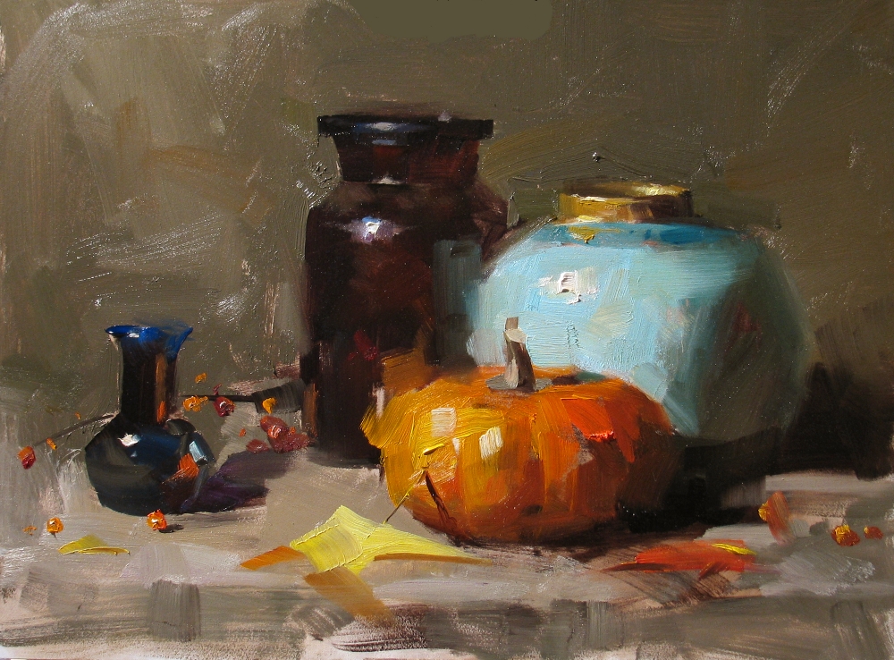
Monday, October 29, 2012
"Kristen"

From Alabama to Connecticut, I did three workshops in a row. I was pretty tired, but I just can't let any chance of learning passing me. I did this portrait sketch on Saturday. I will let you know more about this event with my next post.
Sunday, October 28, 2012
"Demo at Wethersfield 2012 2" --- Sold

This is my second demo on my workshop at Wethersfield. Thanks to all the artists for making this event happen. I really enjoy coming to New England the third time this year.
Wednesday, October 24, 2012
"Demo at Wethersfield 2012 1" --- Sold
Monday, October 22, 2012
"Demo at New Braunfels 2012 3"

Now, I am back to my studio, and taught a couple of children's art classes over the weekend. Tomorrow I am on my road again. Nowadays, my life is so dynamic. I started to lose track where I have traveled to. It is a busy life, but it is good life. I wish I have started my art journey a little earlier. I would have more energy and more potential. So if you are also want to follow your heart and chase your dreams, do it as soon as possible. Do it Now. Yes, I am talking to YOU.
Friday, October 19, 2012
"Demo at New Braunfels 2012 2" --- Sold

Thursday, October 18, 2012
"Demo at New Braunfels 2012 1" --- Sold

Wednesday, October 17, 2012
"Demo at Montgomery 3" --- Sold

I have really enjoyed the southern hospitality at Montgomery, and got more southern accent in my English. I came back yesterday, but a few hours later I will be on the road again. I will tell you where I am going at my next post.
Sunday, October 14, 2012
"Demo at Montgomery 2"

Saturday, October 13, 2012
"Demo at Montgomery 1" --- Sold

Wednesday, October 10, 2012
"Asian Pear" --- Sold

Now I resume my color study. This is my third attempt to establish a color scheme for purple. In this painting I use yellow to establish a complementary scheme with purple, since I have understood that high chroma for purple is very difficult to achieve. The highest chroma of the purples is only 43, but it looks pretty intense due to the contrast with the yellow. I didn't use any cadmium yellow colors. What you see here are yellow ochre and naples yellow. I deliberately keep the chroma of the yellow low, so the purple will stand out more, but I find out during my color mapping that even yellow ochre has a very high chroma (95). I feel better with this painting than the two I did before, but I need to go further.
Tuesday, October 9, 2012
"Half Orange" --- Sold

After about two weeks of color design study, I decided to take a break. I did this painting with my usual approach. I took off my ice skating shoes, and walk normally. I hope I can bring more enjoyment to you as well. I need some time to breath in, and breath out. Calm down and relax. The journey of art keeps on going. So please enjoy the process.
BTW, I do have question: Is there a color very very dark but opaque? I would appreciate if you let me know. Thanks.
Sunday, October 7, 2012
"The color purple 2"

This is my second data point for purple. Analogous is my color scheme and main color is purple. I understood now I can't tint too much from the tube color if I want to keep the chroma high. So I select a dark purple object. I used dioxazine purple. After the painting I did a color mapping (that is the color analysis tool I developed a week ago) on it. I found that the chroma of the tube color of dioxazine purple is not very high (63 out of 100). The slight tinting I did decreases the chroma to 55, which is very similar to what I did in my previous purple study. I am still not there yet, but I surely know more about purple now.
Saturday, October 6, 2012
"Not Bule, it is Cyan" --- Sold

Here is the other painting I did two days ago. Since I am in blue (as matter of fact, I am a little blue in mood lately), I want to talk more about this color called "cyan".
Many years ago when I was just into oil painting, I learned a little bit about color. I was told the red, yellow, and blue are primary colors; orange, green, and purple and secondary colors; red/green, orange/blue, and yellow/purple are complementary. You get grey if mixing the complementaries together. Now I find out this color model is so WRONG. I can guarantee you will not get grey if you mix those "complementaries". In Munsell color wheel, there is no color orange. Now I use the computer HSV color system (similar to Munsell), The six base colors are red, yellow, green, cyan (or turquoise), blue, and magenta (or purple). You see orange is dropped, and cyan has been added in. These six colors are evenly distributed on the color wheel. In other words, each of the pizza slide of these six colors are equal in size (60 degrees in angle). If we use the old color system, the orange slide will be very narrow, only 30 degrees, while the blue slide will be very wide (120 degrees) if we think cyan belongs to blue. With the HSV system the complementary pairs are red/cyan, yellow/blue, and green/purple. Now you can make greys, not mud.
Friday, October 5, 2012
"The color of blue 4"

Yesterday, I did two paintings. Here I just show one to you. I revisit the color blue (turquoise or cyan to be more accurate). Now I understood that I can't tint too much the tube color if I want to keep the chroma high. So this will limit my leverage of value change. Pthalo turquoise is very dark color, but I want to show lighter value, what should I do? With my first painting, I used analogous scheme, and high value background. It didn't work, because I have to tint the turquoise a lot. The color got bleached. The second painting showing here works I think. I did two things. I made background darker, so the value of blue object does not need to be too high. Secondly, I used complementary color scheme to enhance the color contrast. Even the chroma is not very high (chroma = 79, (100 is the highest)), but the complementary scheme bushes it up.
Because I am concentrating on color scheme and harmony lately, I let the composition go. My painting may be too simple and not exciting artistically. This painting is very modern looking. But I am not crazy. I will win your confidence back.
Thursday, October 4, 2012
"The color purple"

The study is going. With this one I worked on the color purple. This one has some problems. I want the purple color to be high in chroma, but it didn't happen. If I tint the color, the purple is very quickly lose its chroma (or intensity). I was using quinacridone magenta. Most of the purple colors are dark (low value) if you use them directly out of the tube. If you know a mid or light purple with intense chroma, please let me know. Thanks.
Wednesday, October 3, 2012
"Clear and Cool"
My color design study has gained more momentum. In this painting my main color has shifted to ultramarine blue. The color scheme is still analogous. I want to stay with analogous scheme to guarantee the color harmony. I feel it is working. I will exercise more to become more skillful.
Tuesday, October 2, 2012
"The color of blue 2" --- Sold

This my second try on doing a color design with blue. The color scheme is still analogous. I minimized the use of yellow. There are two blue I used: on the bottle I used phthalo turquoise, and on the background and the small cup I used ultramarine. My camera has a limitation. The turquoise color is not showing as strongly as the painting showing. I feel much better about this one.
I have to say I am doing a very left-brain dominated research right now. Each of the small painting I do recently is one data point for me. Song (my wife) is very concerned about me. This exercise may hurt my business (it is very scary). I have moved away from my usual style, and put on many restrictions on me deliberately. Many of you might have similar concerns just like Song does. Why are you doing this? Qiang must be crazy now. Well, my explanation is: what I am doing now just like a person want to learn ice skating. I know how to walk, but I deliberately put on those weird shoes with blades underneath. Now I can not walk. I even don't know how to stand. I have to start with baby steps. That is the hard time I am giving to myself now, because I know I will have more freedom in the future.
Monday, October 1, 2012
"The color of blue"

I think I am giving myself a hard time. I force myself not to use red and orange colors for while, I want to see if I still can paint good paintings. My newly developed color analyzing tool has shown some use for me. The color scheme of the this one is majorly analogous and slightly complementary. The center of focus is obvious. The blue does stand out, but not strong enough. Now I need your help: how can I make this color scheme more exciting? Oh! I just got a thought, I am going to do a Daily Paintworks Challenge, so you can show me a couple of things. See you on DPW.
Subscribe to:
Posts (Atom)


