Saturday, May 3, 2014

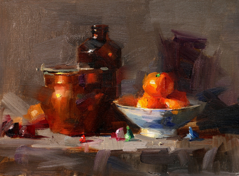
“White in Color"

Click Here to Bid

Continuing my exploration, I did this one. It has very similar color scheme of my yesterday's painting, but I adjusted the value a little. I feel the most important part is that I pay attention of colors on edges. Very high chroma color can be used along the edges creating so much drama. I am so excited.

Well I must step on the breaks now.  I will teach two workshops in Texas starting tomorrow. I may apply my experimental results on my demos during these workshops. You will see.

Friday, May 2, 2014

"White in Dark"

Click Here to Bid

Having been back to Austin for a few day and swamped in all kind of chores. However, I did manage using my fragmented time to paint. On the foundation of high key painting I have established previously, I want to go further. For this project, I have absolutely no local color in the setup. I had a small white jar against the white background, and the jar is in shadow completely. All the colors are contributed by the light sources and environmental reflections. The goal of this painting is to show: 1. Using dark color to present light objects, and 2. Using intensive colors to present white objects. Is this called Impressionistic?

Wednesday, April 30, 2014

China Painting Trip Reminder

Friends, I want to remind you of our China painting trip this September. Please check our "China trip webpage" (or click the widget on the right) to get detailed information and sign up. Our trip to China last year was very successful. Some travelers even want to go again this year.  After the trip announcement in February, many friends emailed us asking information. I know many of you are thinking about participating this time, but need to see if it is possible for you to arrange to go. However, time flies by so fast. Traveling to China takes extra time to take care of logistics. We need to start to preparing for the trip including applying for  visas, booking the international travel, and preparing the tour.

We have been informed by our Chinese tour company that they need to know how many people are going so they can start to reserve hotel rooms and domestic travel in China. Since we will visit some very popular places, we need to reserve the rooms several months ahead. So far we still have openings for this trip. If you are interested in signing up please register as soon as possible. We would like to close the trip applications on May 31, 2014, so we can confirm how many people are going and provide the information to our Chinese tour company, so they can issue the necessary invitation documents for the visa applications.

If you have already decided to sign up, please click Registration.

I am looking forward to having a fantastic time in China with you.


Monday, April 28, 2014

Olympic National Park

After the Whidbey Island workshop, Song and I decided spending a few days in the Olympic National Park. This is a photo I took yesterday morning. The beauty in the park is unbelievable. The new spring green overlapped the dark evergreen. The shows come and go.  We were caught into this beautiful scene surprisingly.  Life is full of surprises. I was lucky to be at the right place and right time. Please enjoy.

Saturday, April 26, 2014

"Demo at Whidbey Island 2014 4" --- Sold

My workshop at Whidbey Island was 4-day. Upon on the request, I did this portrait demo from live on the last day. I have not painted portraits for a while. I was a little nervous at the beginning, but the result turned out OK. Everybody has enjoyed this demo.

Thursday, April 24, 2014

"Demo at Whidbey Island 2014 3"

The third demo is high key and show how I paint flowers. I had cherry blossom this time. It is a very complicated flower.

Wednesday, April 23, 2014

"Demo at Whidbey Island 2014 2" --- Sold

This is the second demo I did for the workshop. I feel I have mission to accomplish. You see the background color of this painting. It is a so called "dirty" or "muddy" color. Currently I don't have very clear understanding how to distinguish "muddy" and "muted" colors. I know there must be some identifiable factor to tell the difference. I believe a color looks muddy in one condition and looks muted (but clean) under another condition. They are actually the same color. The key is to figure out in WHAT condition this will happen. The background color for this painting works well. Can you tell me why?

Tuesday, April 22, 2014

"Demo at Whidbey Island 2014 1" --- Sold

Feels great coming back to Whidbey Island, WA. I want to thank Cary Jurriaans for organizing this workshop, and thank all the artist friends from all over for attending. In this workshop we have an artist coming from South Africa. I really appreciate the support from all of you to my art and teaching. Art has no borders and no language barriers. I am so grateful I stepped in to this wonderful field.

Saturday, April 19, 2014

“Blue Bonnet 2014" --- Sold

Click Here to Bid

The blue bonnet season is coming to the end this year in Texas.  I did this painting with my residue momentum of my high key exploration. I will pause of my small painting exercise and go to Seattle for a week. So this painting may be my last glimpse of this beautiful flower for 2014. However, something ends implies something new will happen. I am looking forward the special beauty in the spring of the Washington State. Now I start to realize the significance of knowing that everything will reach its end eventually. We tend to hold on what we have and feel sad when we reach to the end or death. However, the truth is that this ending feeling is the biggest illusion. We all have an eternal life, here now and forever. Ending is always the beginning. I will see new flowers, they are different, but equally beautiful.

Tuesday, April 15, 2014

"Bright Texas Light"

Click Here to Purchase

I am glad the tax time is over. I have been glued on Turbo Tax solidly for about a week and categorized every dollar I have spent. I really want to thank Tricia Butler for guiding me through the whole process. I can't believe I have dealt with more than five thousand transactions and money went in, out, and between among more than 18 financial accounts. I know all of you have to deal with the same thing and I have no place to brag how much I have achieved in the field of accounting. You know I rather spend more time painting, but without know the art of living, I don't think I can survive.

I have to step on the brakes for my high key experiment now. Very soon, I will travel again. I did this 9x12 today, partially as a demo to my Austin mentor group. After the class, I have added more stuff in the setup. So far I can't say I like high key better than my usual low key approach, but this experiment is not bad. However, it is definitely incomplete. My understanding about color is still very fuzzy. I will continue for sure when I get another chance in the future.

Sunday, April 13, 2014

"Color of Easter" --- Sold


Click Here to Bid

Easter is the time I see so many pastel colors. It is suitable to my recent high key painting experiments very well. I used purple background this time. I thought I was making a purplish gray. According to my CSA, the background color only has a chroma value at 33 (100 means pure color), but somehow the background looks too colorful purple to me, and the photo show it even more colorful. I don't know why. I will work more to achieve a better understanding.

Thursday, April 10, 2014

"Tulips in Spring" --- Sold

Click Here to Bid

My friend Jane brought me some tulips. The colors are so beautiful. I don't remember I painted tulips before. Now you have it.

For my recent high key paintings. I really pay attention to the background colors I use. They are colored grays. I am experimenting on how to enhance the colors in the center of focus by using different gray backgrounds.

Wednesday, April 9, 2014

"Apple and bottles" --- Sold

Click Here to Bid

The song I mentioned in my previous blog was "Demons" by Imagine Dragon. My son Jonathan introduced this song to me. In terms of music, Jonathan and I have no generation gap.

I continue exploring the high key approach.


Monday, April 7, 2014

"Blue Purple and Red" --- Sold

Click Here to Bid

Putting blue and red together is not a best color combination. Then why did I still do that? To be honest with you, I really don't know at this moment. I always think myself is a rational person, but recently I am not really consistent. Well, it is not true either. These two colors are showing strongly in my emotion lately. Recently, my mood is kind of sad and in rage. I can't explain. I disguise my true self when I face the world. It must be a coincidence, but I heard this lyric: I wanna hide the truth. I wanna shelter you. But with the beast inside, there's nowhere we can hide ....... Now I hear this song all over the places. We really need to think: What is happening, and why?

Friday, April 4, 2014

"Cool Feeling" --- Sold

Click Here to Bid

I have got more feeling about high key paintings. It looks like I have stepped into an exciting field. It gives me more opportunities of showing colors.

My friend, are you doing your taxes? I am doing mine. Oh boy, I thought I want to live a simple life, but somehow life is getting more and more complicated. Be careful, be mindful, and take it easy (even it is not easy).

Wednesday, April 2, 2014

"Morning Fresh" --- Sold

Click Here to Bid

I confess that I was obsessed in software developing. Thanks to some of you for introducing me to a few online tools and apps. My CSA tool has improved a little, but it still need much more development before it becomes user-friendly.

The reason I was into color scheme analysis is that I am dealing with more color designs more with my high key approach. I like the color scheme in my today painting, but I have hard time to explain to you. I have not grabbed the tangible rules of color aesthetics, but I do believe there exist such rules and I will get them eventually. When I was in LA talking with Jeremy Lipking, We discussed Denis Dutton and his thinking about aesthetics. It is possible to understand beauty in a more scientific manner.

Tuesday, April 1, 2014

"Color Scheme Analysis"

In order to improve my art. I can not rely only on my intuition and practice. Research and theorizing is also very important. To achieve a good color design, I do "Color Scheme Analysis (CSA)". The image above is an example. With a painting image, I pick up a few representing color samples, evaluate their HSV (hue, chroma, and value), and map them on the color wheel.  The distribution of those colors on the color map informs me if this painting has a good color design.  Other way around, if I see a painting appealing to me, I run CSA on it. Its color map will show a specific distribution. Understanding this distribution helps my color designs for my future paintings.

I started doing CSA a year ago on GIMP. The process is tedious and time consuming. But I don't know other software that does this and I have no time to develop this tool. These a couple of days, I have figured out a way to plot the color map with NUMBERS on my Mac, but I still need GIMP to obtain HSV values. Eventually I will have an app for everybody to use. If you know similar tools exist, please let me know.

Friday, March 28, 2014

"Lonely Onion" --- Sold

Click Here to Bid

It has been two days after I came back to Austin. I have sent out all the filter orders (Sorry for the delay). Last night I resume my daily study. Here you have it.

We were in a rush when we left home for California, and this onion was left on the kitchen counter. After we came back, I found it has sprouted beautifully. So I select it as my model for my first painting during this time period I stay home. I am continuing my high key study. As a warmup session, I didn't design seriously. I like the colors in the shadow and the texture of the leaves and the onion. The color scheme is ok.

Tuesday, March 25, 2014

“Demo at Los Angeles 3" --- Sold

After my previous post, I have received very large amount of comments and emails. I am very happy to said I have received UNANIMOUS support and encouragement. I wish I can write back to all of you individually to thank you, but that is beyond my ability. So here I want to express my deep appreciation to all of you for supporting me, my art, and my teaching . You give me confidence to keep going. I feel the best way to say thank you is to make my art better and my teaching more effective and accessible.

My today's painting is the third demo at LAAFA. Since my teaching load has increased significantly than last year, my time used for studying is very limited. So I started to combine my exploration into my demos. In my most recent 3 workshop (Nashville, Sacramento, and LA) I did three high key demos. there is a blue tea pot in all of them. I remember I mentioned once that I want to entitle these paintings as "This Is Not My Cup of Tea", because high key is not a comfortable way for me to paint. I hope my workshop artists do not mind I do experiment in my demos. There is a risk I may fail right in front of you. So far I feel lucky. My high key still lives are progressing.

Last night I met the young master artist Jeremy Lipking. I want to thank my art friend Christy Young for introducing Jeremy to me. I have been admire his work for a long time. I had a great time in Jeremy's studio. He is such talented artist.

Monday, March 24, 2014

"Demo at Los Angeles 2" --- Sold

This is my second demo at LAAFA.

Recently, I visited a friend of mine. From the conversation with him, I have sensed something new. My friend is a very successful artist. He told me something interesting: The night before I visited him, he had a party in his house. He told everybody that he will have a visitor tomorrow. This guy was a Ph.D. in physics, but now he has quitted his job and became an artist. The party reacted unanimously: This guy is nuts. He must have a brain problem. Moreover, He is not only stupid, but also selfish and irresponsible to his family. They can not rationalize the behavior of this stupid guy. Finally, they concluded that this behavior is the symptom of the mid-age crisis.

I really appreciate the honesty of my friend. It is true that I work harder and make less, but I have never regretted I made my decision. It is not surprise some people not agree with me, but why people UNANIMOUSLY disagree with me. Maybe I am a real self-centered fool. I heard Ph.D. stands for Permanent Head Damage. So please let me know what your think. Please comment and email to me. Thanks.

Saturday, March 22, 2014

"Demo in Los Angeles 1" --- Sold

I felt very good doing this demo painting. Thanks to LAAFA for organizing this workshop and thanks to all the artists for attending. I found a few unusual props here. I enjoyed very much of painting new stuff.

Friday, March 21, 2014

"Demo at Sacramento 3" --- Sold

According the request, I painted my third demo showing how to do leaves and folds on the drape. I like high key color scheme more and more now.

I have arrived at LA. Los Angeles Academy of Figurative Art (LAAFA) is a very professional art school. I am very impressed by what they do here.

Wednesday, March 19, 2014

“Demo at Sacramento 2" --- Sold

The second demo does not have much of color. As usual, I showed how to paint a rose.

Tuesday, March 18, 2014

"Demo at Sacramento 1" --- Sold

This my third time teaching at Sacramento. I want to thank Patris Miller for organizing this workshop and thank all the artists for attending. This is my first demo. This year I have a very busy teaching schedule. This workshop is my 7th of the year.

Sunday, March 16, 2014

Visiting Zhaoming Wu

I arrived at San Francisco a couple of days ago. I stayed with one of the best figurative master painters Zhaoming Wu. If you draw or paint figures, you must know his work. If you don't know this artist, google him right now.

Tuesday, March 11, 2014

"Demo in Nashville 3" --- Sold

Rules are made to be broken. So on the third day of my workshop, I showed how I destroyed the procedures I have established in the two previous days. Am I contradictory to myself? No. Artists really need both side of the brain. On one side, you need the controlled process to execute the effects you want to show. On the other hand, you don't want to be restricted by the process. You try new things and explore new territories. This demo is high key with cool color dominant. I don't usually do this kind of paintings in workshops. I have mentioned to the class: I want to entitle this painting as: "It is not my cup of tea".

Sunday, March 9, 2014

"Demo in Nashville 2" --- Sold

This is the second demo. I found several "kisses" and put them in my setup. They are very decorative giving me more color opportunities for the foreground.

Friday, March 7, 2014

"Demo in Nashville 1" --- Sold

My workshop at Nashville started yesterday. I want to thank Jeanie Smith for organizing this workshop, and thanks all the artists for coming and painting with me. This is my first demonstration.

Wednesday, March 5, 2014

Nashville Tennessee

I have arrived at Nashville, TN. A moment ago, I took a short walk from the B&B I am staying. I stepped on the campus of the Belmont University. It is a quite a lovely place. After sunset, it was getting dark quickly. I snapped a few shots with my phone to document this visit. New place and new experience. Life is so dramatic.

I stayed at my Austin home too short, only got a chance doing one small painting. However I have got many other things done. In comparison, painting is rather easy. Life itself is much harder, and it gets more and more complicated and challenging. I keep reminding myself: I came to the world, the purpose is not to accomplish anything, but to experience the whole life process as sensitive as possible: the Time, the Space, the Change, and the Eternity.

Sunday, March 2, 2014

"Blue Flower" --- Sold

Click Here to Bid

I don't know if you have noticed, when I do low key (i.e. dark background) paintings, I hardly use any cool colors with high chroma at my center of focus. I feel it does not look colorful when a cool color object against a dark background, it looks more black-&-white to me. Imagine a lime with a black drape in the back. I feel the lime look pale. However, if I put an orange against the black, it looks much more colorful. In contrast,  I did a high key painting today. I used a blank canvas as the background and high chroma blue color for my center of focus. You know what, I feel the blue showing beautifully, much better when using a dark background. From all above observations, can I generalize and say: warm colors show better with dark background, and cool colors show better with lighter background? Is there any aesthetic relationship between hue and value? Pardon me for being so ignorant, I have not heard anybody's comment about the value and hue are not independent if you want to form an appealing color design. If you know someone has documented this relationship please let me know.