I have been slowing down and I have not posting on social media as often as before. There are so many fake short videos overwriting meaningful information. I long for the good old days.
I have been slowing down and I have not posting on social media as often as before. There are so many fake short videos overwriting meaningful information. I long for the good old days.
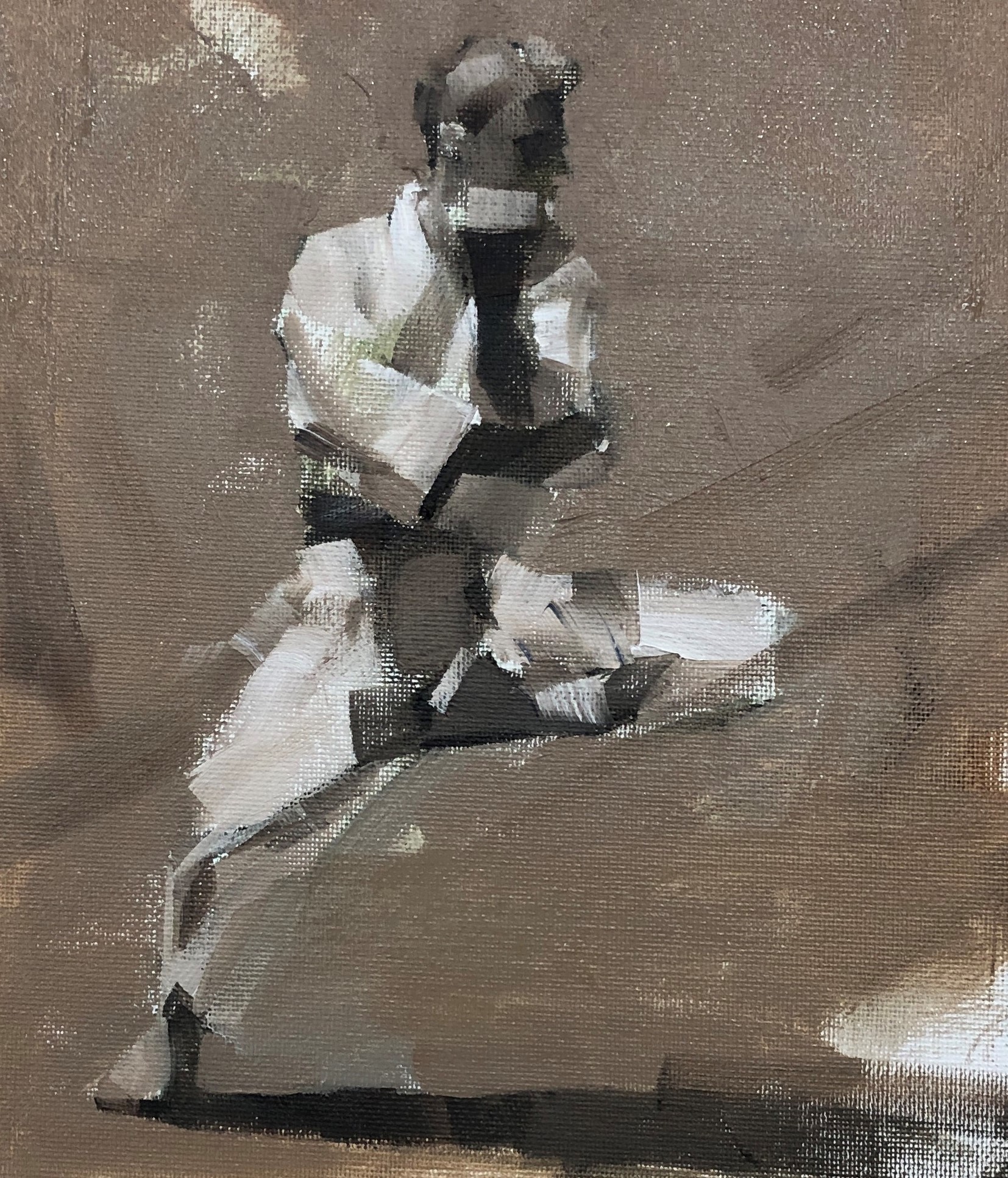
This is my demo on my figure painting workshop in Cloudcroft NM. This was my very first teaching figurative art. You know I don't do figure very often. This demo turned out better than I thought. Maybe I should do more.


The last demo on my SLC workshop. Again, I had a quite amount of touch-ups on it. I have painted this painting before, a few times, but I still see room for improvement. This experience of refurbishing old paintings really gives me confidence that I still can get better. I am happy to see that I did not overwork the painting. I think a lot when I re-work on a painting. I did see the refurbished painting get tighter. I hope my future work can get looser. So please wish me luck.

I will teach a 3-day figurative painting workshop at the Fine Art Museum of Huntsville, Alabama. I will share with you my approaches to suggest human forms within a landscape setting. Figurative painting is exciting but relatively difficult to manage, especially for beginner artists. On this workshop, I want to show how to paint figures when we haven't had enough training in drawing and lack of knowledge of human anatomy, I will share computer tools which help us to manage proportion and color. We still have openings for this workshop. If you are interested in learning my painting techniques, please check the workshop webpage and sign up.

The 2nd demo at SLC. I have worked more on it. I only have about 2 hours of demo time each day on a workshop. It is rather difficult to take care of all the issues. I am glad I have time to work on old paintings to give them a new look. Recently, I often ask myself: what will make a landscape painting look better. Working on old paintings really has advantages than starting a painting from scratch. All the elements have been established. I have more time and energy to re-think and re-do the composition, color, and mark making. I have a big inventory of semi finished paintings generated from passed plein air competitions. So I have a great potential. It is different from refurbishing a cell phone or computer, re-touch a painting will make the quality and value of the painting exponentially. I am wondering why I have not thought about this method before.

I just came back from teaching a workshop at Salt Lake City. This was my 1st demo. I have touched up some today to bring the demo painting to a finish look. I have been painting landscape for a while, but I know in my bones that I am not a good landscape painter intuitively. To improve my landscape paintings, I have to rely on my left brain to analyze what is going on. I have told my students during the workshop: we are not gifted enough to be good in art naturally. If you want to be good, you will do 3 things. 1. practice a lot. 2. use whatever tools you can access to. 3. Go quantitative instead of qualitative.

In painting, color temperature is such an ambiguous concept. For example: orange vs yellow, which one is warmer? Ultramarine vs phthalo blue, which one is cooler? Artists do not want to quantify their color temperature. Their argument is: color is so relative. We only see a color warmer or cooler with respect to another color. This fuzzy ambiguity bothers my engineering mind. So I went to the field of photography. Lo and behold! I found their concept of color temperature is so crispy clear. They quantified the color temperature using K or Kelvin. The "warm" colors have lower K, while "cool" ones higher K. Therefore: orange is warmer than yellow, violet is cooler than turquoise (so ultra is cooler than phthalo). I found a photographer's temperature scale online, and measured 11 color samples. I plot those samples on the CIELuv (pls ignore this nomenclature except the color scientists) color wheel. I was shocked by what I have found. Ah-ha!! Now I know. (1) For very warm colors (red to yellow, or 1 to 4) the temperature varies with the HUE change. Similarly for very cool colors (turquoise to violet, or 8 to 11). This finding reminds me the "prismatic palette" some artists talked about. They follow the rainbow when they paint. (2) For the moderate warm and cool colors (from yellow to blue, or 4 to 8), the temperature varies with the CHROMA change, then flip the hue at the center of the color wheel to the complementary. I feel this understanding can help us to paint better: when you deal with very warm colors like sunset, you can change temperature by hue shifting. However when you deal with grey and subtle colors, you change temperature by chroma variation. Voila!

I have participated a plein air paint out last Sunday near Johnson City, Texas. It was a hot day (98F). I have learned from this painting was that my lightest value was actually rather dark. However, it appeared quite bright, feeling the hot Texas sun shined right on the concrete sidewalk. I don't have to use a lot of white to make something look bright, because we view color (and value) relatively. I painted the blue sky relatively dark, so the roof and sidewalk appeared brighter. I want to thank Carla Bosch, the Adams Galleries, and Untamed Wine Estates for making this event possible. I really appreciate they gave me the First Place award.

This a small plein air study I did when was at Wayne PA. As a personal growth in painting, I have realized two major changes are happening. 1) I am no longer emphasize on the value. I tend to reduce my value range by brightened the shadow. This way the colors have more playing space. 2. I pay more attention to light colors rather than the local colors. This painting show more color play in the shadows, and the colors were generated mainly by light sources and reflections. The houses themselves do not have much local colors, but on the painting, they are really colorful. I know the color relationships on this one is still clumsy. My skills still need more time to improve. Hey, this was plein air. I felt very lucky I didn't get hit by a car when I paint this. I was too close to the busy traffic there.

"Color of Colorless" is a small study I did today. I put a white cube on a white board to make sure no local color got involved. I set two lights, one cool and one warm. The temperature contrast of the light sources produced all the colors for this painting. This study maybe the simplest way to demonstrate the warm and cool colors. Most people think the colors "belong" to objects, such as a lemon is yellow, a lime is green, and this cube is white. This "object color" understanding does not help a painter. We paint "perceived colors", which is the interaction among the light source colors, the object color reflectance, and environmental color contributions. If we can see the color (we often not), and be able to mix it, we can paint.

I am very happy to announce that Derek Penix will come back to Austin and teach a 3-day painting workshop on February 23 - 25, 2024. Derek is a contemporary master painter of using abstract design to present almost realistic subjects. His workshop "Loosen Up" is very popular and it will sold be out very quickly. I am not kidding. If you want to learn for this young master, please take action right now. Please check: https://www.qhart.com/dereks-workshop-2024 for information and registration.


I am very happy to announce my art activities for the coming 2024. Now the pandemic is off the way, We have resumed our invited artists' workshop programs. I am excited to let you know that the pastel and oil painting master Albert Handell will come to Austin and teaches two workshops. I admire Albert's art for a long time. I really like his way of showing subtle greys. I love his harmonious color designs. Albert Handell is a master on both pastel and oil painting. We have planned two workshops in 2024 for him. In January workshop, Albert will demo in pastels, and in March workshop, he will demo with oil. However, students can use either pastel or oil. If you are interested in learning from Albert Handell, please check: https://www.qhart.com/workshops/workshops-2024 to get detailed information and sign up.


At the recent Wayne Plein Air Competition, My painting "Afternoon at Androssan Farm" won the "Best Barns, Bridges & Backroad Award". This painting has many different greys. The interplay among the light source, reflected, and material local colors formed a subtle and rich color composition, which I really worked on recently on my landscape paintings. What should I do to make a shadow look like a shadow? What is the difference between grey and mud? How to make color play on a landscape painting more interesting? Those are a few questions I constantly ask myself.


This is a demo painting on the Dahlonega workshop. I like the combination of a well designed mechanical device and organic shapes. There is one type of contrast I always apply to the painting, but it is very difficult to express in English. Very vaguely I can say: it is solidness vs. non-solidness. In Chinese we call "Xu" (虚)vs. "Shi" (实). If someone good at linguistics, please help me translate these two terms. The clock is "Shi" but the pot of flowers is "Xu". I think you know what I mean.


It was a happy plein air day at the Chanticleer Garden. The temperature was just right. I was painting under the sun, but it is not too hot. I did 3 painting that day. It was my record.


I consider this the best painting I did during the Olmsted Invitational. After doing color research so long, I got really sensitive to the color relationship between light and shadow. A good representational painting should present good color solidity. I think this one does.

I am very happy to announce that the master artist Hsin-Yao Tseng will come to Austin and teach a 4-day workshop on November 11 - 14, 2023. Hsin-Yao is from Taiwan. We became good friends when we were attending the Academy of Art University of San Francisco in 2012. More than a decade has passed, Hsin-Yao has become a real master of cityscape, figurative, floral, and painting in general. Please check Hsin-Yao's website to see his beautiful paintings. His work is romantic and expressive. If you are interested in attending Hsin-Yao's Austin workshop, please check: https://www.qhart.com/hsin-yao-tsengs-workshop-2023 for detailed information and sign up. I am looking forward to seeing you, and learning from the master.

This is the demo I did for the Olmsted Plein Air Invitational. It was fun.

Olmsted Plein Air Invitational ended today. I did well. I got one award, and sold a few paintings. I am tired and happy.

This is another blue bonnet painting. I consider it is mediocre. I must admit that I have not generated much of good paintings lately. I know exactly why this has been happening: because I am re-learning many things in art. These a couple of months, I am learning the science-based color theory like drinking from the firehose. You might have viewed some of my short video demonstrating interesting color phenomenon. That was just the tip of an iceberg. I was so involved of searching information online, and doing my own color studies. I wish I can show the progress on my paintings right now, but it takes time to find the right directions, and gain the right knowledge, then practice and develop new skills and experiences. Eventually, I should be able to show good effects on my paintings. I am progressing in baby steps. Please be patient with me. I will catch up. Please believe: old dogs are still able to learn new tricks.

I did a few plein air blue bonnet paintings. I tested my recent understanding of CYM limited palette, and it worked. I used quin red, hansa yellow, and phthalo blue, and white. It was a little hard to mix grey with this palette, but for high chroma blue and green, it works well. My theoretical understanding does give me correct guidance. So now I painted more scientifically, instead of using experience (or intuitively).
So far I have found at least 4 types of color mixing mechanisms:
1. Additive, which applies to mixing colored lights. Blue and yellow gets white.
2. Subtractive, which applies to mixing transparent pigments or filters. Blue and yellow gets black.
3. Average additive, which is shown in this video. Blue and yellow gets grey.
4. Paint mixing, which applies to mixing opaque pigments. Blue and yellow gets green.
Isn't the color world amazing?!