Wednesday, May 31, 2023
The Wayne Hotel
Monday, May 29, 2023
Albert Handell Painting Workshops
I am very happy to announce my art activities for the coming 2024. Now the pandemic is off the way, We have resumed our invited artists' workshop programs. I am excited to let you know that the pastel and oil painting master Albert Handell will come to Austin and teaches two workshops. I admire Albert's art for a long time. I really like his way of showing subtle greys. I love his harmonious color designs. Albert Handell is a master on both pastel and oil painting. We have planned two workshops in 2024 for him. In January workshop, Albert will demo in pastels, and in March workshop, he will demo with oil. However, students can use either pastel or oil. If you are interested in learning from Albert Handell, please check: https://www.qhart.com/workshops/workshops-2024 to get detailed information and sign up.
Friday, May 26, 2023
Afternoon at Androssan Farm
At the recent Wayne Plein Air Competition, My painting "Afternoon at Androssan Farm" won the "Best Barns, Bridges & Backroad Award". This painting has many different greys. The interplay among the light source, reflected, and material local colors formed a subtle and rich color composition, which I really worked on recently on my landscape paintings. What should I do to make a shadow look like a shadow? What is the difference between grey and mud? How to make color play on a landscape painting more interesting? Those are a few questions I constantly ask myself.
Wednesday, May 24, 2023
Salt Lake City Workshop
Saturday, May 20, 2023
Old Time
This is a demo painting on the Dahlonega workshop. I like the combination of a well designed mechanical device and organic shapes. There is one type of contrast I always apply to the painting, but it is very difficult to express in English. Very vaguely I can say: it is solidness vs. non-solidness. In Chinese we call "Xu" (虚)vs. "Shi" (实). If someone good at linguistics, please help me translate these two terms. The clock is "Shi" but the pot of flowers is "Xu". I think you know what I mean.
Thursday, May 18, 2023
Radnor Train Station
Plein Air at Radnor train station. Painting a believable light and shadow relationship is the topic I am working on. Paint light-n-shadow is not a simply value variation. It is also inadequate if we only notice the temperature difference between light and shadow. The chroma relationship of light-n-shadow is also very important. I have learned recently: light and shadow should have the same color saturation, but varying chroma. Please be noted: color saturation and chroma are two totally different concept in color science. I have not fully figure out the light-n-shadow relationship yet, but I know if we get the light-n-shadow color right, the object under the light looks very solid. To achieve color solidity is the goal I am pursuing currently.
Tuesday, May 16, 2023
Happy Peonies
It was a happy plein air day at the Chanticleer Garden. The temperature was just right. I was painting under the sun, but it is not too hot. I did 3 painting that day. It was my record.
Friday, May 12, 2023
Wayne Plein Air Competition (Part 1)
I have been plein air painting a few days for the Wayne Plein Air Competition. I did 8 paintings so far. Today is the last painting day. I have turn all my paintings in. I am so tired, and have no energy to write. Please enjoy the images.
Friday, May 5, 2023
Light on Druid Hills
I consider this the best painting I did during the Olmsted Invitational. After doing color research so long, I got really sensitive to the color relationship between light and shadow. A good representational painting should present good color solidity. I think this one does.
Wednesday, May 3, 2023
Hsin-Yao Tseng painting workshop
I am very happy to announce that the master artist Hsin-Yao Tseng will come to Austin and teach a 4-day workshop on November 11 - 14, 2023. Hsin-Yao is from Taiwan. We became good friends when we were attending the Academy of Art University of San Francisco in 2012. More than a decade has passed, Hsin-Yao has become a real master of cityscape, figurative, floral, and painting in general. Please check Hsin-Yao's website to see his beautiful paintings. His work is romantic and expressive. If you are interested in attending Hsin-Yao's Austin workshop, please check: https://www.qhart.com/hsin-yao-tsengs-workshop-2023 for detailed information and sign up. I am looking forward to seeing you, and learning from the master.
Monday, May 1, 2023
Sunday, April 23, 2023
The Gold Dome
Olmsted Plein Air Invitational ended today. I did well. I got one award, and sold a few paintings. I am tired and happy.
Thursday, April 13, 2023
Blue Bonnets at Wild Flower Center
This is another blue bonnet painting. I consider it is mediocre. I must admit that I have not generated much of good paintings lately. I know exactly why this has been happening: because I am re-learning many things in art. These a couple of months, I am learning the science-based color theory like drinking from the firehose. You might have viewed some of my short video demonstrating interesting color phenomenon. That was just the tip of an iceberg. I was so involved of searching information online, and doing my own color studies. I wish I can show the progress on my paintings right now, but it takes time to find the right directions, and gain the right knowledge, then practice and develop new skills and experiences. Eventually, I should be able to show good effects on my paintings. I am progressing in baby steps. Please be patient with me. I will catch up. Please believe: old dogs are still able to learn new tricks.
Thursday, April 6, 2023
Blue Bonnet at Anderson Mill
I did a few plein air blue bonnet paintings. I tested my recent understanding of CYM limited palette, and it worked. I used quin red, hansa yellow, and phthalo blue, and white. It was a little hard to mix grey with this palette, but for high chroma blue and green, it works well. My theoretical understanding does give me correct guidance. So now I painted more scientifically, instead of using experience (or intuitively).
Sunday, April 2, 2023
Blue and Yellow are Complementary
So far I have found at least 4 types of color mixing mechanisms:
1. Additive, which applies to mixing colored lights. Blue and yellow gets white.
2. Subtractive, which applies to mixing transparent pigments or filters. Blue and yellow gets black.
3. Average additive, which is shown in this video. Blue and yellow gets grey.
4. Paint mixing, which applies to mixing opaque pigments. Blue and yellow gets green.
Isn't the color world amazing?!
Friday, March 31, 2023
Workshop reminder: Dahlonega GA
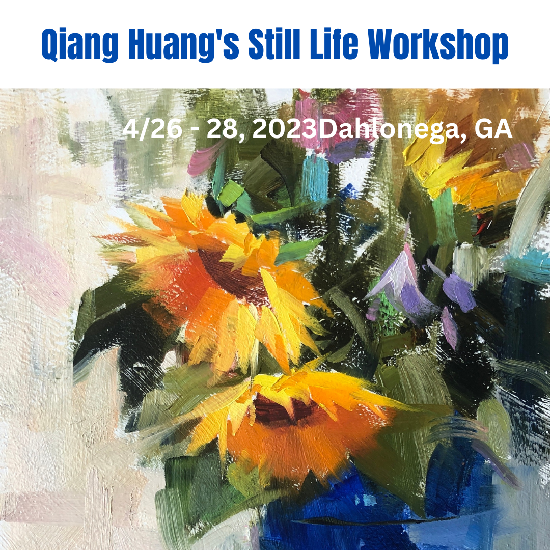
I will teach a still life painting workshop in Dahlonega, GA from 4/26 to 4/28. The week before this workshop I will attend the Olmsted Plein Air Invitational painting competition. During the Olmsted event, I will do a painting demo in Atlanta. If you are an artist in or near Atlanta, you are more than welcome to come and see the demo. If you are interested in attend my painting workshop, please check Artloft workshops for more info and sign up. Thanks,
Wednesday, March 29, 2023
I have posted a new video today to touch the foundation of our color understanding. Most of us have been taught that red, yellow, and blue are primary colors, and they can not be mixed from other colors. However, the traditional color teaching has misled the art community for so many years, and this misinformation still continues. From experiments, we can see the dogma is not true. If you want mix the largest range of colors from 3 colors, please consider cyan, yellow, and magenta. In terms of pigments, please try cobalt teal, cad yellow, and quinacridone magenta. If you think teal is too light, you may try phthalo blue or turquoise instead. I will explain why CYM gamut is larger than RYB one in my future post.
Friday, March 24, 2023
Eric's backyard
Wednesday, March 22, 2023
Chat with a color expert
A few days ago I was interviewed by Peter Donahue, a very knowledgeable color expert and teacher. Peter teaches a science based color theory, and he uses Tiktok, YouTube, and Instagram to teach. We artists have been taught the wrong color theory from the very beginning. Nowadays, there are still quite a mount of books and media are spreading the wrong color teaching. I have learned the hard way. Peter has wealth amount of information about color on his channels. Please check: https://www.tiktok.com/@color.nerd?lang=en
Tuesday, March 21, 2023
Green study
Sunday, March 19, 2023
Home, Sweet Home 2
This painting was a plein air piece I did last year at the quick-paint competition of the Olmsted Plein Air Festival. I modified it recently based on a photo I took. Whether or not it had been improved artistically, I am not sure, but I am sure the green colors are more accurate. It was spring time like now. All the greens were fresh and intense. I used what I have learned about color lately and mixed the green colors really close to those on the ref photo. Greens are so rich in content, but we are short of words to describe them, I feel so grateful that we have numerical way to present them and we can pin-point their locations on the color wheel. The two images here demonstrates the difference between a scientific approach and a way of pure intuition.
Sunday, March 12, 2023
Limited Palette Mixing Capacity
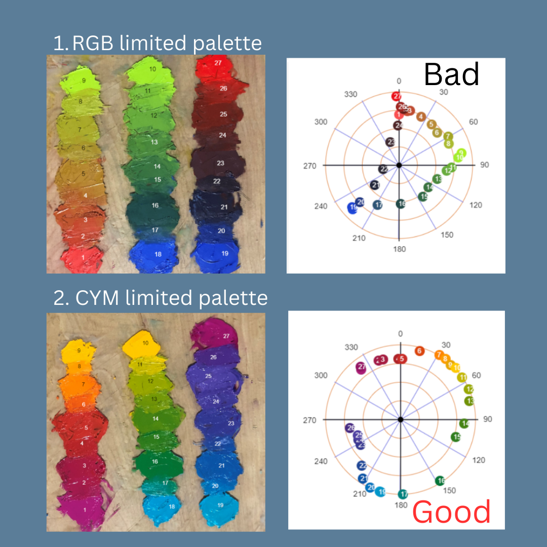
Two days ago, I posted my experimental result of RGB vs CYM limited palettes. Today I expanded my experiment including Zorn and RYB palettes. First of all, I want apologize that I should not label my result with simple minded "good" or "bad". All palettes have their own suitable applications. The purpose of this experiment is to demonstrate which 3-color limited palette has the highest mixing capacity, i.e. it can produce the widest range of colors. Please note color harmony and whether it can generate the best painting are not my current intention. I may address those issues in our future discussions. On today's presentation, the colored area are all the colors mixable with the given 3-color palette. Specifically, the Zorn palette was consist of cad red light, yellow ochre, and ivory black; RYB palette: cad red, cad yellow deep, and ultramarine blue. RGB and CYM palette have been described previously. The result is pure experimental. I conducted real paint mixing, and performed the measurements with my home made computer app "Color Analyzer" (located on my website, it is free for anyone to use). I hope this understanding helps you paint better.
Friday, March 10, 2023
RGB vs CYM limited palette
To form a limited painting palette, we often use 3 primary colors. This experiment demonstrates the different mixing power of using RGB vs. CYM. For RGB primaries, I used cadmium red light, cadmium green, and ultramarine blue. On the color wheel, we can see the color gamut is rather small, means the colors can be mixed by the 3 selected primaries are rather limited. For CYM primaries, I used quinacridone magenta, cadmium yellow deep, and cobalt teal. on the contrary, we can see the color gamut is significant large, the 3 selected colors can mix much more colors than the RGB case. It is so obvious we can see the secondary colors mixed by RGB are quite dull (low chroma), while the secondary produced by CYM are much more intense (higher chroma). Therefore, we conclude the CYM forms the best limited palette, while the RGB is not a so good choice for a limited palette.
Wednesday, March 8, 2023
Blue + Yellow = ?
My color research continues. Now I am working on mixing greens with blues and yellows. From our experiences, we all know blue mixed with yellow producing green, but on the computer color wheel, blue and yellow are complementary. It has been shown that mixing blue and yellow lights produces white light (additive), and overlapping blue and yellow transparencies, or mix blue and yellow ink, produces black (subtractive). So I mixed blue and yellow oil paints (manganese blue hue and cadmium yellow deep) as an experiment, and tracked the mixing path on the color wheel. I have seen that the mixing path does not go straight, but follows a curved path going through the green zone. This is why blue and yellow mix green. The curved mixing path is so important, but most artists do not know this including myself until this experiment. I have searched online to see if there is any theoretical explanations. I have found something called "Kubelka - Munk" equation. The K - M equation also explains the tinting induced color shift as I experienced earlier as well. If anyone have played with the K - M equation, please let me know. I want to learn more.
Thursday, March 2, 2023
Workshop at Dahlonega, GA
Wednesday, March 1, 2023
Higashiyama Kaii
This is my version of Higashiyama Kaii. I love the way he handles the green colors. Green is a very hard color. I have learned a lot by copy the masters.
Thursday, February 23, 2023
Morning at Ruffini Chapel
I did this painting as a commission piece for a collector. I have used two ref photos for this project. The first photo gave me the perspective, but it did not give me good light and value. The second photo has good color but with totally different perspective. I really like the colors of the pavement in front of the church. My recent color study helped me tremendously.
Monday, February 20, 2023
New Video on Color Tinting Analysis
My color mixing experiments continued. A couple of days ago, I posted my observation of mixing ultramarine blue with white (tinting). I have noticed that the blue color has not only got lighter, but also has a hue shifting toward turquoise. Now I want to show this "tinting induced hue shift" occurs commonly to many tube colors. This short video shows what happen when I tinted 5 more colors. I noticed that 4 colors out of 5 have had the hue shift. Among these 4 colors, the most significant hue shift happens to transparent orange. We can see it changes from red to orange then even yellow during tinting. Of course, the color of the illumination source and the camera white balance may contribute to the hue shift, but this contribution is small. I also noticed the hue shift does not occur to all the colors. Yellow ochre in the video did not have the hue shift during tinting. I might have opened a can of worm, but we may be on something. I really appreciate the active discussion after my previous video post, and you all more than welcome to do your own analysis.
Friday, February 17, 2023
Workshop Ad
Wednesday, February 15, 2023
I did some color research lately. This video shows I mixed ultramarine blue and white together, and then analyzed this "tinting" process with the "Color Analyzer" app. This app is developed by two engineers and myself. It is located on my website: https://qhart.com. You can access it by clicking the "Apps" tab, then click the button "Color Analyzer". It is free for anyone to use. Via this experiment, I have discovered that adding white to ultramarine has actually changed its hue toward turquoise. This result has violated my theoretical understanding. I thought that tinting should not change the hue of the color but only increases its value and decreases its chroma. In other words: it should be a straight line toward the center of the color wheel. I have found that is not the case. I don't understand why this happens, but I must accept the experimental result from the scientific point of view.


.png)